Opentype Features in Microsoft Word
OpenType features are a great way to add flexibility to fonts. With them, font creators can add a huge variety of useful options to their fonts. The problem is it’s not always obvious how to make use of these options for the end-user.
Since OpenType is relatively new, many old applications have no options to enable OpenType features–in fact, even most new applications take a selective approach to implementing OpenType features. Worse, those applications which do implement OpenType features haven’t necessarily made it easy for the end-user to figure out. This is especially true in word processing applications.
In this article I will discuss how to enable OpenType features in Microsoft Word.
You must have Microsoft Word 2010 or later for OpenType features.
Features that are supported include:
- kerning
- contextual spacing
- ligatures
- alternate forms for particular letter combinations
- number spacing
- proportional or tabular
- number forms
- alternate numbers forms
- stylistic sets
- alternate letter style sets
- contextual alternatives
- alternate letter styles depending on context
Unfortunately unsupported features include:
- swash characters
- fancy letter forms usually seen at the end or beginning of words
1.) Choose a font with OpenType features
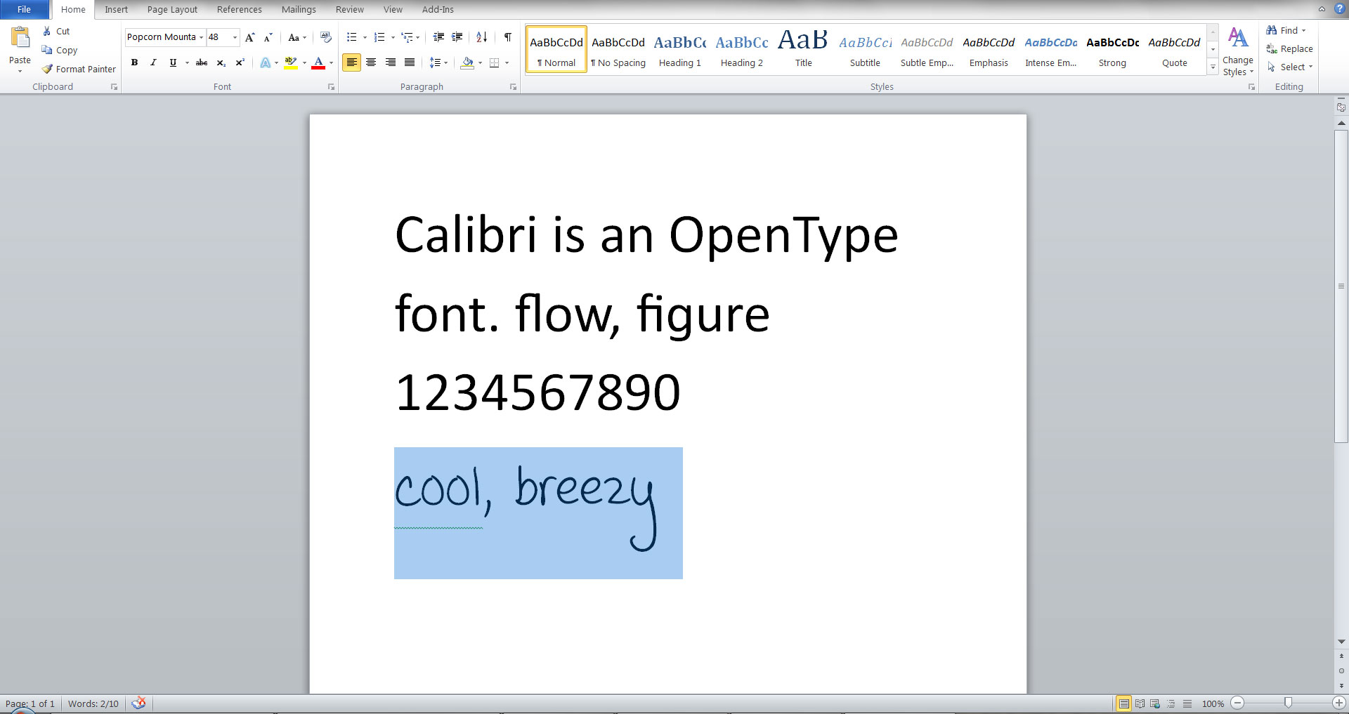
Microsoft’s default font, Calibri, has some OpenType features, so lets use that:
2.) Navigate to the OpenType options
Select all the text you want to enable OpenType features for, then from the “Home” tab, in the “Font” section, click the little arrow in the lower right corner:
3.) Enable Opentype features in MS Word
When you click the little arrow, the “Font” dialog will appear. Go to the advanced tab:
Make the following changes to enable kerning, standard ligatures, and stylistic set 4. You can also experiment with other settings.
The result is text with altered spacing, and a few obvious changes to the ‘fl’, ‘fi’, and ‘g’ characters:
Contextual Alternatives
When I make handwritten fonts I like to create “contextual alternatives”, which you can enable in the font dialog. For example, the font “Popcorn Mountain!” has contextual alternatives for common double-letter combinations, which makes the handwritten font appear more natural.
Again, select the text you want to enable OpenType features for–this time I’m using “Popcorn Mountain!” because it has the OpenType feature “contextual alternatives”:
Check the box for “Contextual Alternatives” in the font dialog (see the section above “2.) Navigate to…”):
The result is alternate characters for the second “o” and “e” in the words “cool” and “breezy”:


